

Welcome!
On most Wednesdays, check this blog for a strategy, process, or reflection for illustration with the iPad app ProCreate. This Wednesday Wrap Up shares my result for a live lesson provided by Jennifer Nichols of Leila and Po Studio in her Creative Journey Community of which I am a member and affiliate. Take a look at other posts from Jennifer’s lessons here: #ipadartwithjennifernichols. If you decide to join, if you click “join here” I’ll receive a bit as an affiliate.
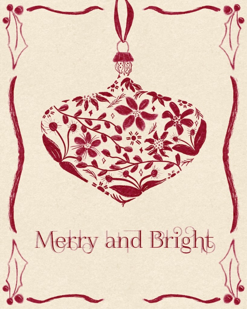
We created our own transparent looking ornament that would make a great greeting card.
The Process
Start with an idea of the types of motifs you would like in your ornament: florals, holiday items, reindeer, holly, poinsettia, pine needles, gingerbread cookies, presents, etc. Perhaps practice a few.
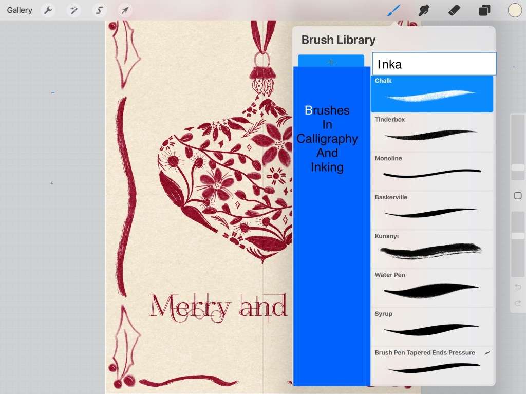
Brushes
The brushes used for this are from Calligraphy and Inking — here are a few I used:
Sketch the shape of your bulb and the top, with a ribbon up to the top of the card. Put this layer at the top on multiply blend mode and reduce the opacity.
Now start drawing in your motifs with the bounds of the sketched ornament. Be sure to make some looking as if curving around the edge. Be sure much of the edge is covered so that the shape of the ornament is obvious.
Here’s my sketch in orange over my design.
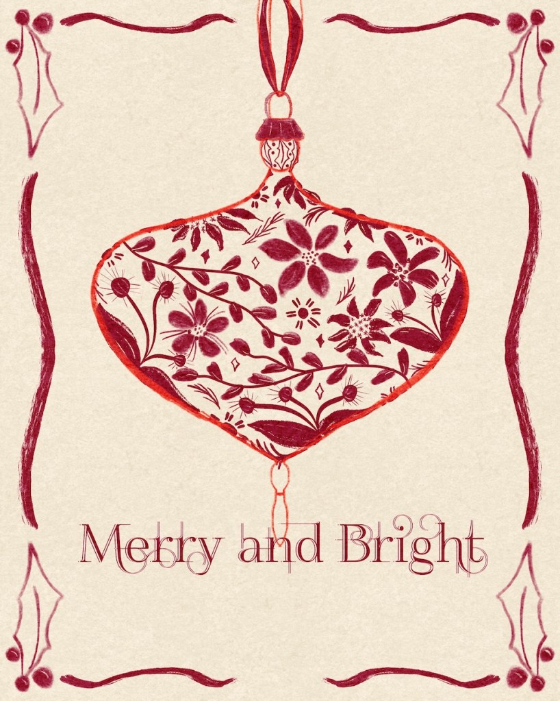
You see how the florals are partly drawn in at the edges to show the shape, and that most of the shape has some motif on the edge. I also eliminated the bottom part of the ornament by not adding motifs into it.
Take a look side by side with sketch and finished version:
Border
I struggled with the border. I tried many different versions and then gave up, just adding the holly that I knew how to draw and the wavy lines.
Texture and Font
I finished with texture paper over all and added the text with a font called “FoglightenNo04,” a public domain font I found a long time ago. I think you can still get it here.
Font / Text Adjustments
I rasterized the text and duplicated it three times. I moved the middle test to the right one or two pixels. I moved the top text to the left two or three pixels. Then I selected the first text, tapped the top text and cleared it with that selected section. I alpha locked the top text and turned it cream to match the background, then I moved it over to the right so it created the light lines on the text below. I did have to clean up a bit of lineage on all three text layers on the “y.”
Replay
To see a replay, click here: Replay of Ornament
Try It:
Give the ornament strategy a try. Add some text and fancy it up a bit with the strategy I shared above. Be sure to share on IG. Be sure to tag Jennifer Nichols and myself. Leila and Po / @42Sheri.
Jennifer Nichols has so much to share about Procreate: lessons, styles of painting [pastels, watercolor, oils, chalk], free brushes and textures, and much more. In addition, the community is friendly and supportive, with many people joining in conversations and our zoom Question/Answer sessions. It’s wonderful to share with other artists and learn together.
If you decide to join, if you click “join here” I’ll receive a bit as an affiliate.
And you’re welcome to follow this blog for art inspiration. We can share with #warmup4art to enjoy our work together! I look forward to your sharing and find me at @42Sheri, on Mastodon Sheri42, on Flickr teach.eagle Sheri 42.