

Inspiration
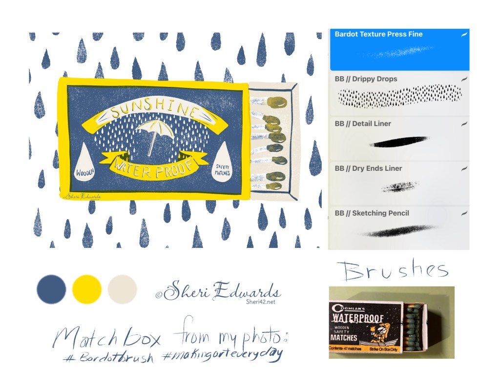
I watched Lisa Bardot’s video lesson on using a reference photo to create a print-screen style illustration, changing up the photo to one’s one vision of the object and using a limited palette, in my case, yellow, navy, and tan.
My Take
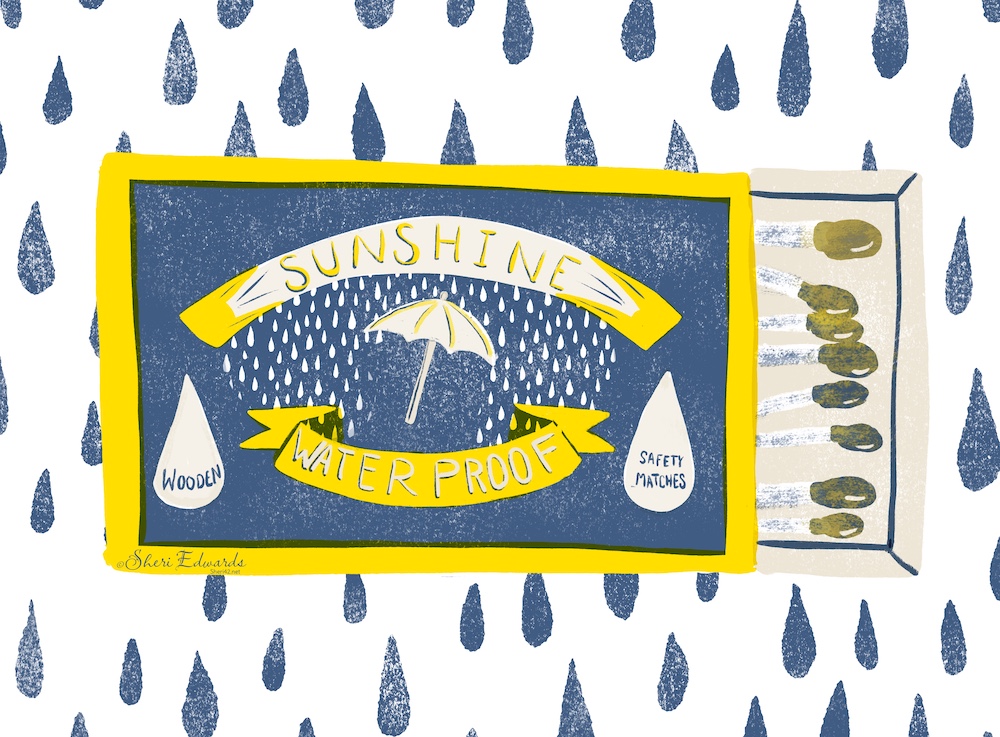
I followed the strategy, using my own photo of an opened matchbox. I changed the name/design to reflect the colors I chose. “Sunshine Waterproof Matches” would work with yellow for sunshine, navy for sky/rain, and tan for the inside of the box. I added in a raindrop background from Lisa’s Imperfect Patterns brush set. Check out the description in the video for links to the other brush sets used.
Try It
Check out Lisa’s tutorial and try the style. It’s loose and fun, something that you could do every day to build your illustration skills. I love using Lisa’s brushes– they always come with a wonderful user guide to help you get started.
Lisa Bardot of BardotBrush and #makingarteveryday helps artists find their style by encouraging a daily practice with the #makingarteveryday prompts and monthly journal. Check it out: #makingarteveryday
#bardotbrush #makingarteveryday #matchbox #febdoodle #warmup4art #cldoodle24

So serendipitous… I just finished a middle grade book about a place in Brooklyn they called the “matchbox” due to the houses that burned down… Seeing your post, I know I am where I’m supposed to be!
LikeLike
Thanks, Joy! I think we are where we’re supposed to be.
LikeLiked by 1 person