

Color Palettes for 70s Design Challenge
I was looking ahead and noticed the suggested palettes for the 1970s Design Challenge on Spoonflower.
I choose my favorite color choice site, color.adobe.com, which I think you can sign up for free there— I have an account and I don’t subscribe to Adobe products. I’ve had it for years. I have created and saved oodles of palettes in my own “library” at the site.
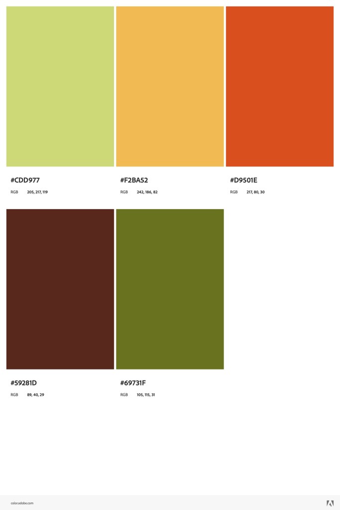
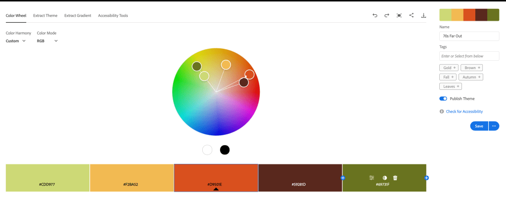
I played around with the tabs “Explore” and “Create” until I found the colors mentioned at Spoonflower: avocado green, burnt orange, mustard yellow, brown, hot pink, turquoise, deep purple. I searched for a set of colors in “Explore” and saved one to my library– creating one called 70s Far Out. I could then edit that palette with hex codes to replace colors to my own choices from the various palettes in my search, saving it with a different name to keep both palettes. That’s what I did to create these. Once created, you can download them.
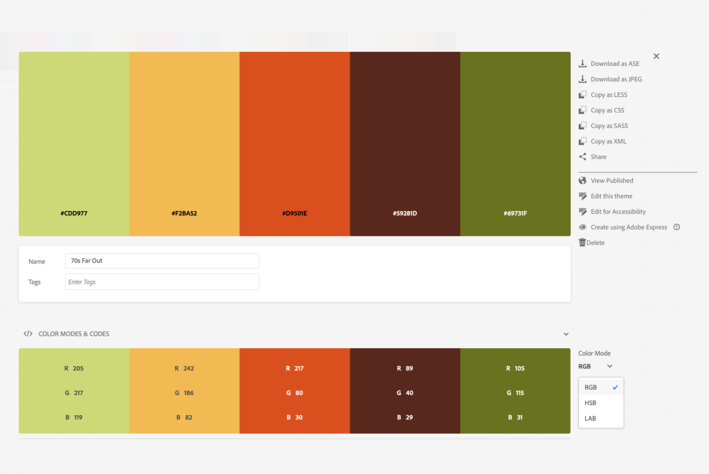
When you open your saved palette, you see this screen:
The palette I had chosen didn’t have the dark avocado, so I added that hex code in edit mode:
I did the same thing for the splashes of color hot pink, turquoise, and deep purple. Here are the palettes I created. You might want to save the images to use when you start to design your 1970s Design Challenge on Spoonflower.