

Symmetry with Reflective Templates
As you know I’m taking Delores Naskrents Affinity Designer MasterClass to learn more about the tools in Affinity Designer. I’ve created many, but these two I like.
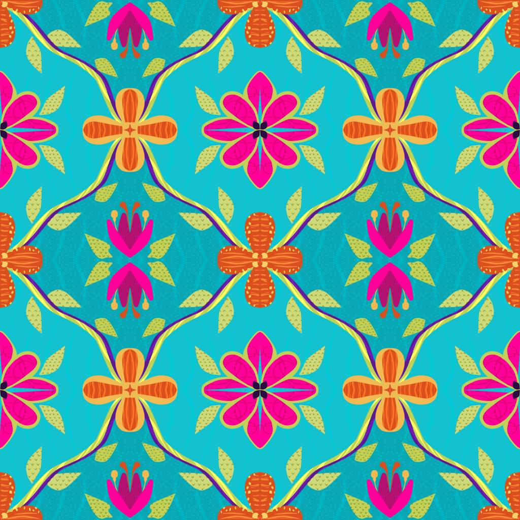
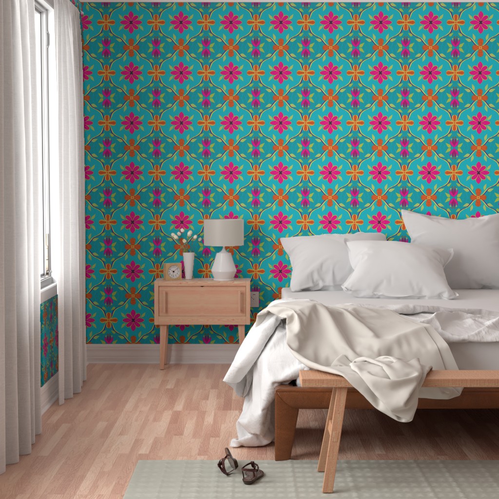
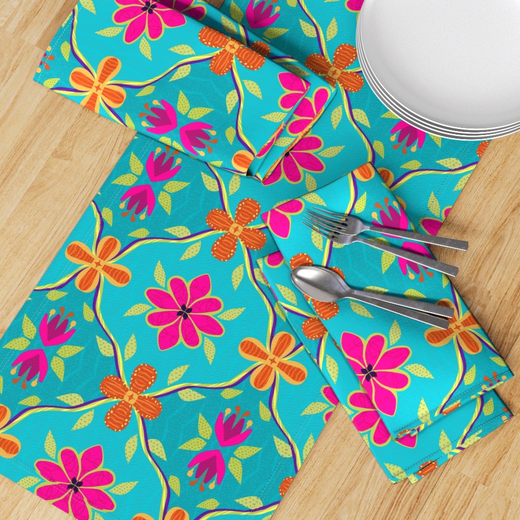
On the left is a pattern for Spoonflower’s 1970s Design Challenge. If you look closely, you’ll see the pattern is created in one quarter of the canvas– and the rest is reflected in doubles across the canvas, top and bottom. It’s a clever template from Delores for the MasterClass, and once I get the hang of it, I’m sure I’ll be able to create some fancy designs. Last week’s WrapUp reviews several of these patterns.
Check out how this bright design adds pizazz to home decor in many ways; click an image to see them on Spoonflower.

Symmetry and Drop Pattern
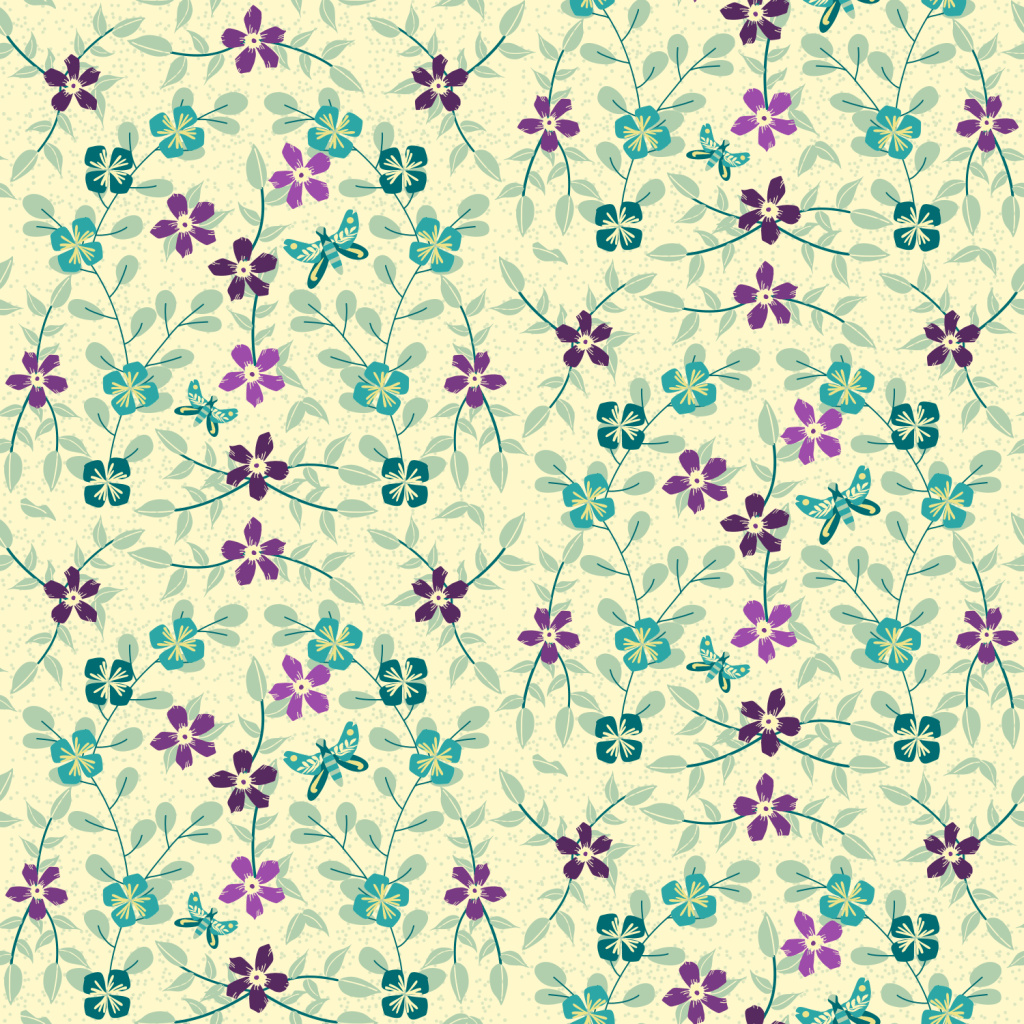
Last week’s WrapUp shared this template in a floral design with birds. I went simpler this time, and I love the result— I turned it into a greeting card for my friend:

Limited palettes help improve the patterns, and it doesn’t matter if you like subtle and muted or bold and bright. Pick a few colors only and see how more cohesive your patterns are.
Another thing we learned in the class is to create re-usable assets. So he periwinkle purple flowers, the blue square flowers, the different leaves and stems, and the butterfly are all separate motifs in my asset gallery, ready for use in any design I need. Even the dots in the background are an asset I created! Pretty nice. I just change the colors, maybe change the centers, perhaps adjust the leaves– but they are all ready as vectors for any design or any size! That’s not available in Procreate. It’s why I’m loving Affinity Designer.
Learning!
I’m learning much about Affinity Designer, so if you have a question, just ask, and I’ll be glad to share what I know. Or check out Delores Naskrents Affinity Designer MasterClass and her Hubspot community — the community you can join for free.
