

Welcome
On most Wednesdays, check this blog for a strategy, process, or reflection for illustration with the iPad app ProCreate or Affinity Designer. This week I workin in Procreate to finish a design challenge and illustrate several birthday cards for family. I didn’t get anything up on the blog yet.
Stone Flow Design Challenge
Spoonflower’s Stone Flow Design Challenge asks us to “Mesmerize us with designs inspired by natural stone formations! This challenge celebrates the quiet drama of minerals — reinterpreted for contemporary interiors.” I wondered for days what I could do– I never quite get abstracts or fluid marbles quite the way I want them. But then, while searching for natural stone colors, I found an image of normal rocks in a garden, but in white, purple, browns, tans — perfect for earthy tones and natural stones.
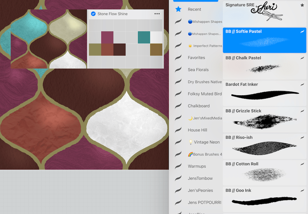
I started out generating some sample palettes at https://color.adobe.com and combined colors with those I liked to achieve this Stone Flow Shine palette.
I finally decided that ogee tiles made from natural stone would create a unique look. To achieve this effect, I mostly used Lisa Bardot’s Goo Ink and some textured brushes, all in the Artist’s Pastel brush set for illustration, playing around with blend modes for the texture and highlight [overlay, multiply, screen, and add]. For tile textures, I clipped repeat pattern textures from Jennifer Nichol’s Creative Journey Community [affiliate link].
I created two mockups, the one above and one with a pink brick wall:
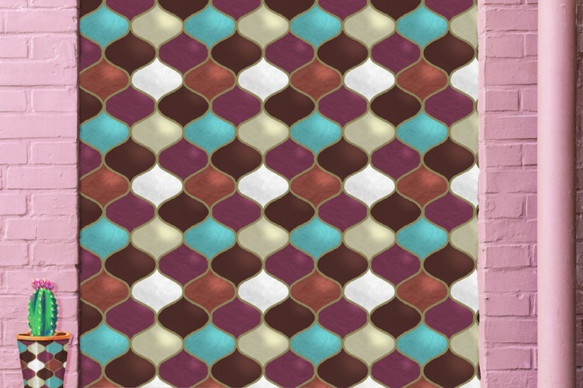
The design keeps growing on me, so I added the highlights to give the natural stone look some shine.
And on Spoonflower, the mockups turned out great:
Stones Shine as Jewels in Earth Toned Ogee Tiles
Earth toned slabs shine like jewels as ogee wall tiles lined in almost gold; terra cotta; marbled quartz; crystal turquoise; shimmering shells; purple mudstone; earthy brown. Click an image to view on Spoonflower.
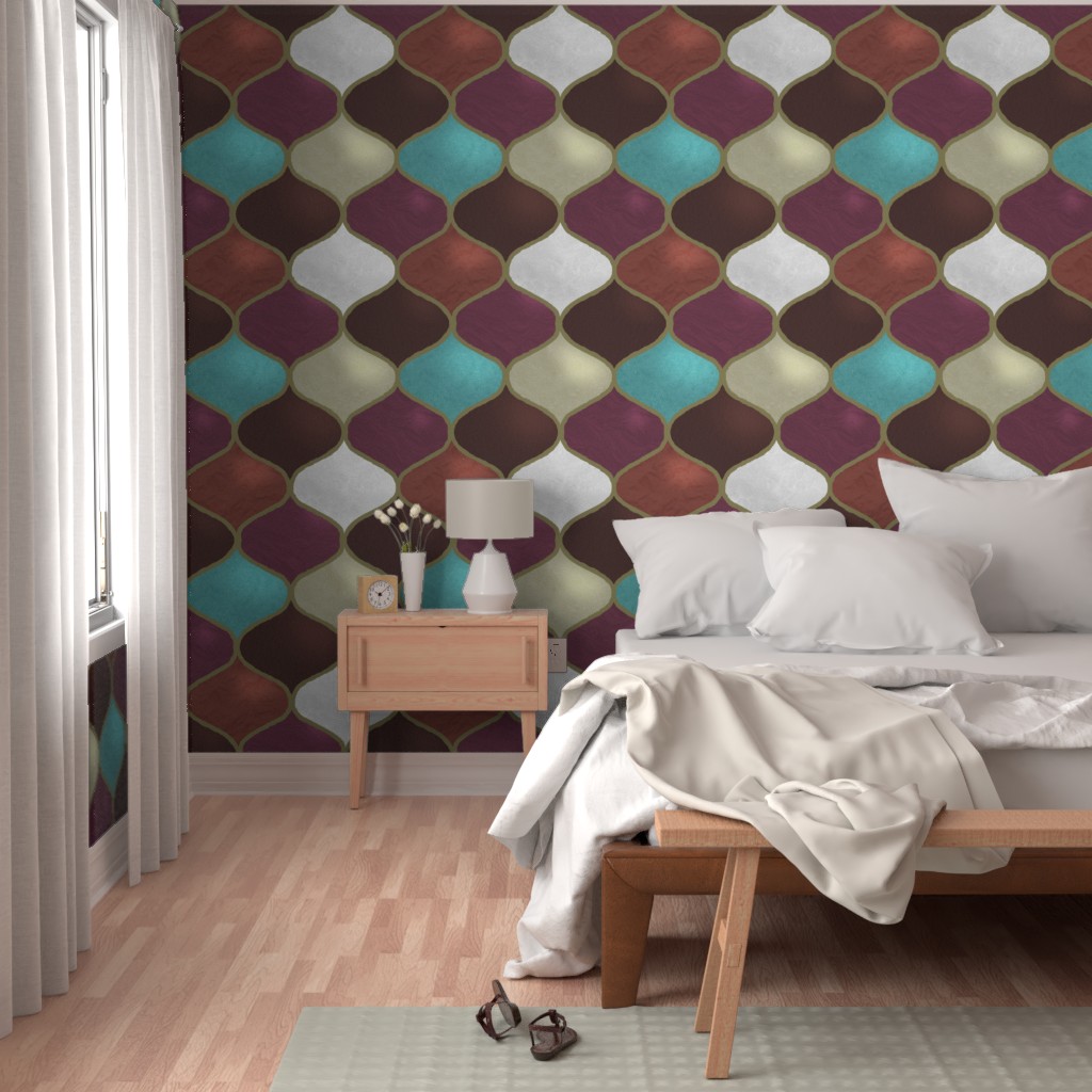
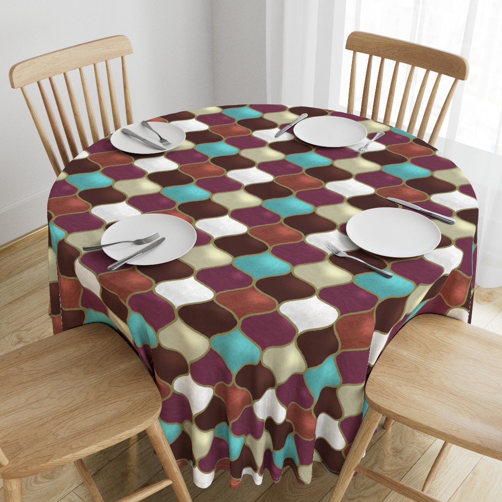
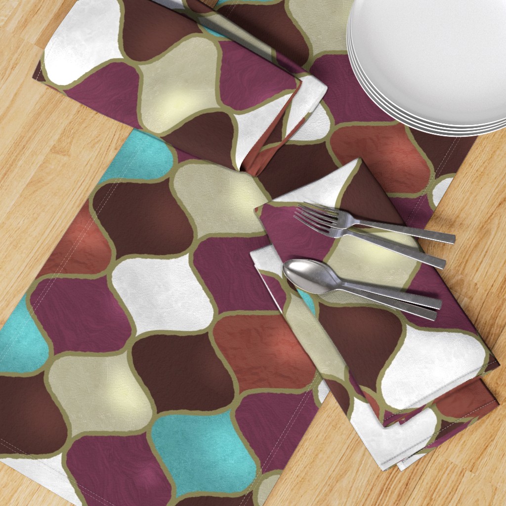

What I’d love to see this design on is a rug…. I’ll look for POD [Print on Demand] rugs to give it a try. This took quite a few hours to get the look right — textures for the natural stones and the highlights. Choose the “almost gold” for the outline of the tiles took a while to find just the right tone. So, what do you think? I don’t know, but that duvet cover is calling me…
And Greeting Cards for Family Birthdays

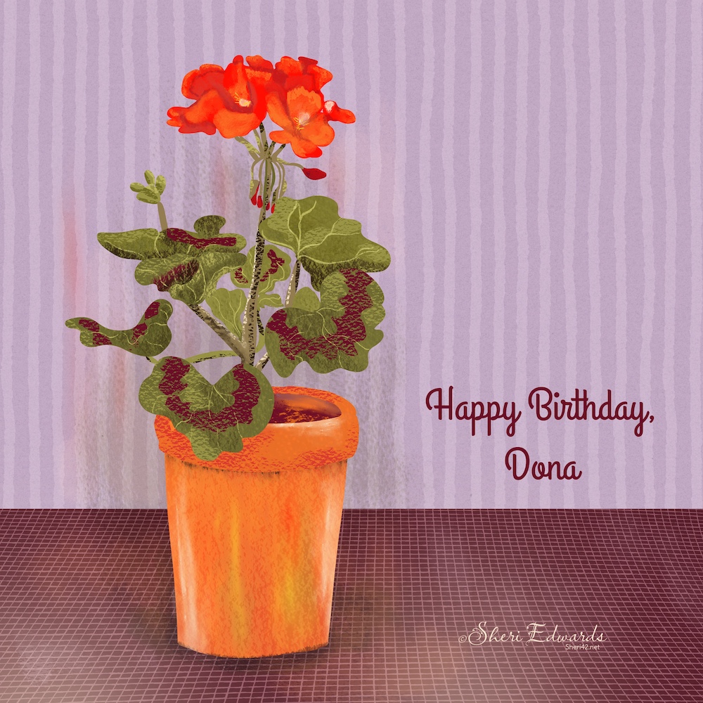


I choose a design for each card based on the person’s likes. Susan is overboard for Halloween!
Thanks for stopping by!
It was a busy week, choosing cards and considering options for the design challenge. That’s part of the challenge for illustration: getting the theme for the purpose. A bit like writing. I’m spending the next two weeks also writing for #WriteOut, a free two-week celebration that will run October 12-26, 2025 where we step outside the doors of our classrooms, homes, and workplaces to write and create. Everyone is invited—educators, students, families, and friends. This year’s Choice Board of outdoor activities and writing suggestions is filled with ideas for what to write about outside, in whatever space you find. Join us. I share on my education blog; all my #writeout posts are here: #WriteOut.
You can find many helpful artists teachers on my Artist Resources page. Take a look at their IG and YouTube. Find one that fits your learning and art preferences and stick with them a while to develop your skills. If you have any questions, just ask!
You’re welcome to follow this blog for art inspiration. We can share with #warmup4art to enjoy our work together! I look forward to your sharing and find me at @42Sheri, on Mastodon Sheri42, on Flickr teach.eagle Sheri 42.