Welcome!
I’ve enjoyed providing each week a “Wednesday Warm Up,”— a day of usually quick drawing, inking, brushing as warm up to our serious art. I’ve been sharing a strategy to try each Wednesday using the iPad app ProCreate. I’ve decided to change it up a bit for a few Wednesday Wrap Up— a wrap up of my project tips for the past week or something I’ve learned that may also help others with the same #warmup4art hashtag.
This Week
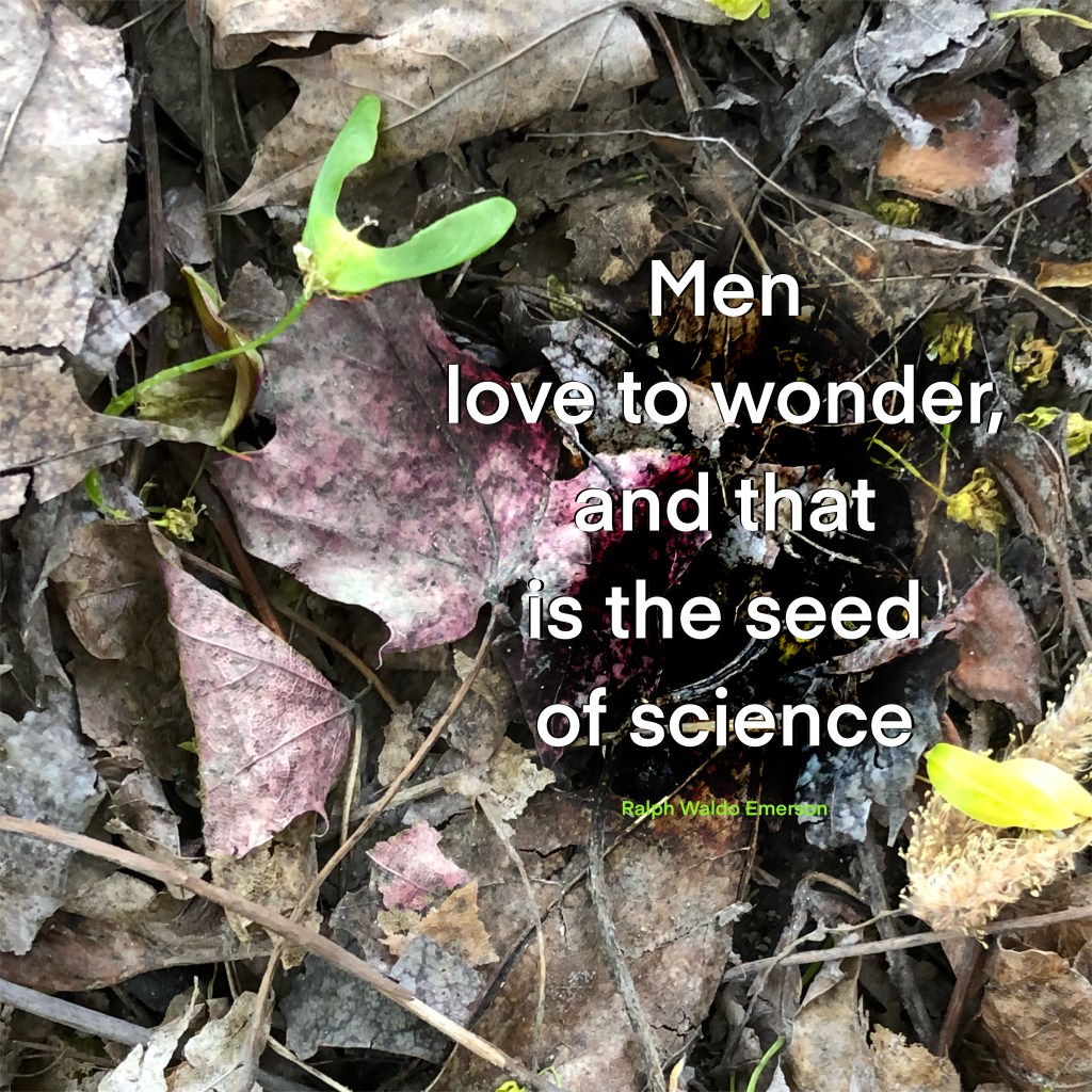
This week I created an “image quote” for the Daily Create [see @ds106dc #tdc3574 ], which was to create an image with a Ralph Waldo Emerson quote. I chose:
Men love to wonder, and that is the seed of science
Ralph Waldo Emerson
and this image on which to place it because it is the sprouting of a maple seed — a bit of science wonder that fits the quote:

The Photo
I snapped this photo from my backyard. I was delighted with wonder at the little maple tree sprouting from its spring seed. And, as indicated, it fit the quote I found for the Daily Create prompt.
However, the colors of most of the leaves are a muted and dull brown. I wanted to add a bit of color so I played around with the selection tool and the adjustments for hue, saturation, and brightness to add a few red leaves:

The Hue Adjustments
After creating and submitting the quote, I thought I could share the strategy with you– so I adjusted the hue of another leaf and recorded the process for you:
All the Adaptations
Cropped square and adjusted the photo placement to balance the green and yellow with room for the quote, I imported the photo into Procreate. With “free hand” selection tool, I selected three parts of the dull brown leaves and adjusted the hue to what must have been red leaves since that color on the scale adjustment seemed most natural— just a fading dusty rose color to take the dull away and create a more interesting effect to enhance the quote.
I also duplicated the quote twice, turning the lower layers black, moving one left and one right to create an outline of black around the letters for better emphasis.
Finally, in black on overlay mode I “free hand” selected and feathered a shape beneath the lettering so the white would stand out better.
Although I originally included a top textured layer, I turned it off because it seemed to blur the lovely green and sprouting maple seed.
And I’m pleased with its natural look, though it is modified as explained. Here’s my submission to the Daily Create:
Try It
So, that wraps up this Wednesday Wrap Up. If you’ve other tips, please share, and if you try it, please share your artistic choices. I look forward to your sharing, and please continue to be a part of the #warmup4art series to learn and enjoy our work together! See my sharing at IG @42Sheri and Twitter @42Sheri.


