

Welcome!
I’ve enjoyed providing each week a “Wednesday Warm Up,”— a day of usually quick drawing, inking, brushing as warm up to our serious art. I’ve been sharing a strategy to try each Wednesday using the iPad app ProCreate. Lately, I’ve change it up a bit for a few Wednesday Wrap Up— a wrap up of my project tips for the past week or something I’ve learned that may also help others with the same #warmup4art hashtag. Today I share two art styles and how I created them– two styles I like, but have much to learn: pop art/ comic and cubism.
Art Prompts
As my readers know, I illustrate daily art prompts with my CLmooc friends. This week I followed the prompts from Lisa Bardot’s #makingarteveryday, which continues the monthly focus of “Grow” with the theme of “Grow Your Style.” One project is “one thing – two ways.” We create two illustrations of the same object in two different ways or styles.
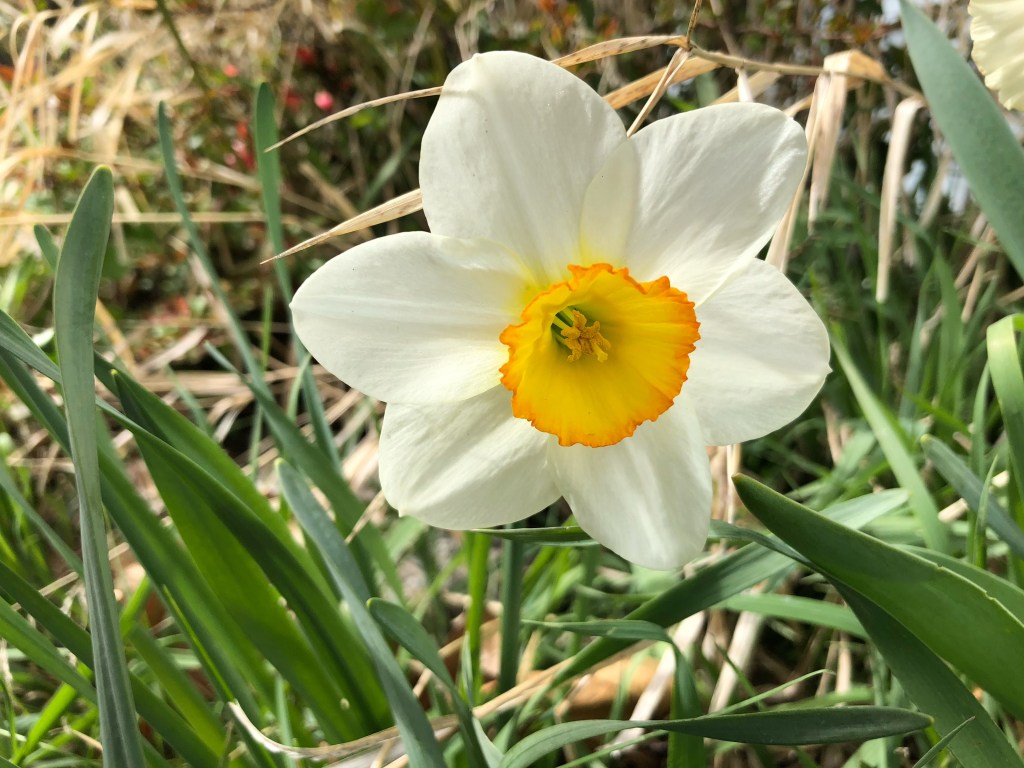
I chose comic/pop art and cubism styles to illustrate daffodils, with the help of Lisa’s Art Styles website. Above is my inspiration: a daffodil from my garden.
Brushes applied are Lisa Bardot Brushes: Midcentury, Scratchy Art, and Imperfect Patterns; Procreate Decimals.
Art Process
Pop Art/Comic
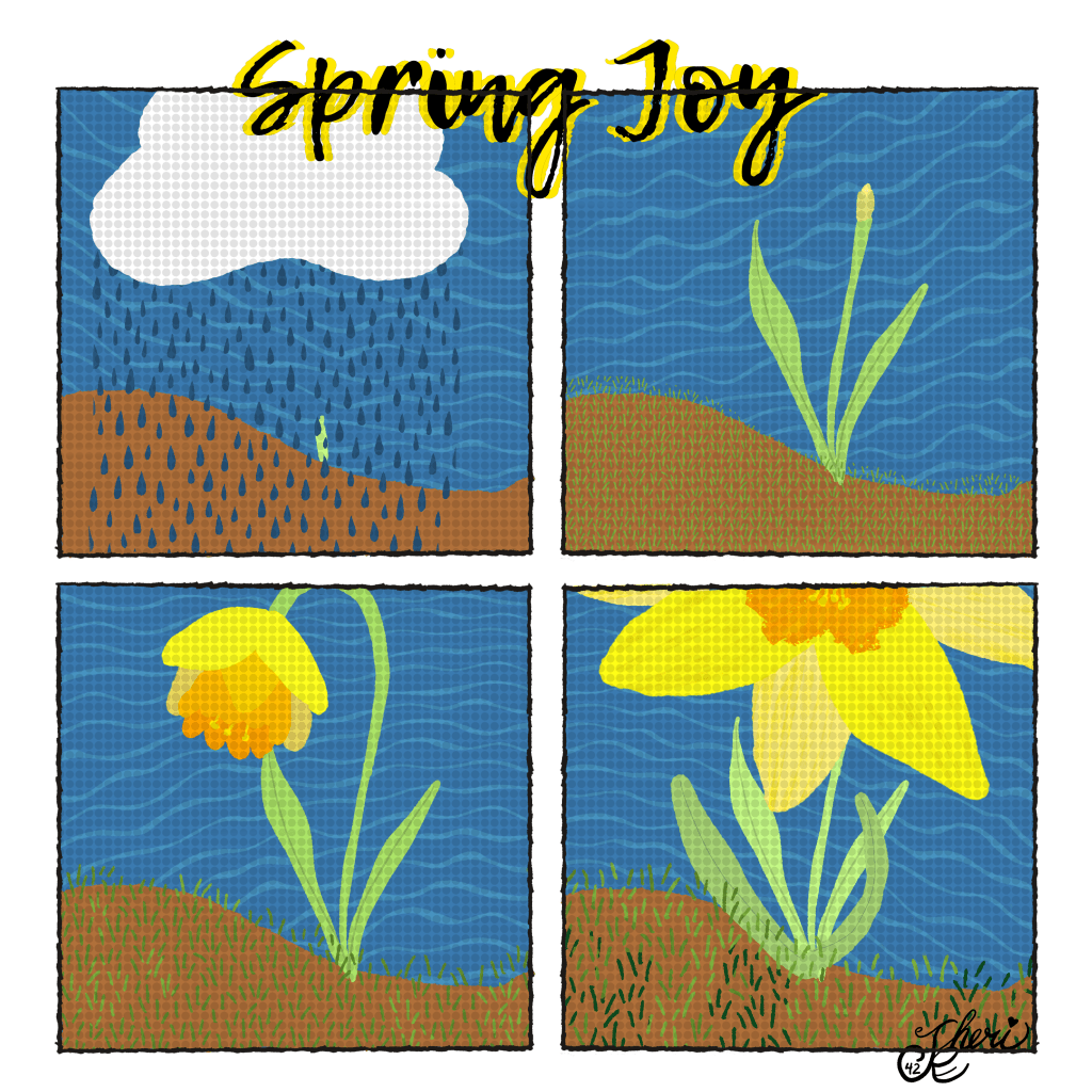
For the pop art / comic style I created four blocks for a daffodil story: sprout, bud, opening, and opened. I should have applied a more brilliant background and started with larger daffodil elements. I finally realized that and made the three daffodils larger, as you may see in the replay below.
I’m not sure why there’s no native “half-tones” so I reduced the opacity on the Procreate “Decimals” brush. It’s not quite the effect I wanted. As I look on it, I also should have outlined all the elements in black. So it seems, for next time, I need to:
- Think bright
- Think large elements
- Outline Black for Bold Look
- Find a half-tone dot brush
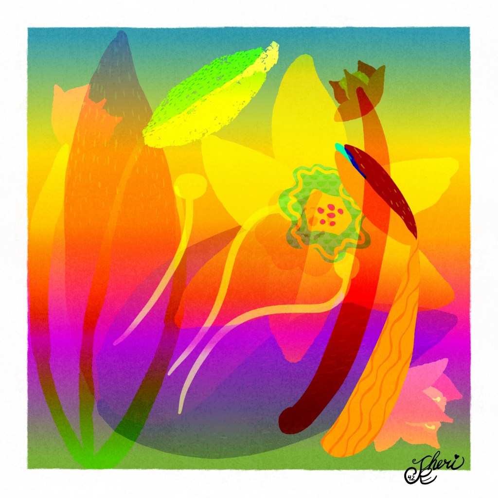
Neon Cubism
For this style, I knew I wouldn’t be “cubing,” but would be abstracting the shapes. So I started with breaking down the parts of a daffodil and then drawing those parts which I could then color and arrange.
As I worked I and looked at some examples, I realized the background is important to this style, so I created a bold striped background using the colors of my daffodil palette. I spent much time with arranging the parts on different layers, adding some texture, and apply blend modes. I call it a success because my husband loves it, and I am happy with it. I call it neon cubism for the bright and bold colors.
Pause for Poetry
As I was searching for my daffodil image, I also found cute videos of our kitten with daffodils and bumble bees, so I wrote a bit of poetry and created a video to include both the kitten and the art. I wrote about my writing process here [What Else Spring Joyous Wonder] should that interest you. And…. enjoy the daffodil joy and the kitten’s wonder:
Replay
Included in the replay are some of the brushes used and the “daffodil parts.”
Try It
So, that wraps up this Wednesday Wrap Up. As we develop our skills every day we choose to make art every day, and stretch ourselves with new styles and reflections on how to get better.
Thanks to Lisa Bardot for her resources. Check out Lisa Bardot for inspiration on her Instagram, YouTube channel, prompts, and website. Also, just click the Artist Gems category on my blog for other teachers and artists that might inspire you. I’ve met plenty in my online digital journey, and Lisa is but one.
By learning from other artists, we build our confidence and learn to adapt and adjust without fear of being perfect— just make art every day!
I look forward to your sharing, and please continue to be a part of the #warmup4art series to learn and enjoy our work together! See my sharing at IG @42Sheri and Twitter @42Sheri.