

Let’s talk success first.
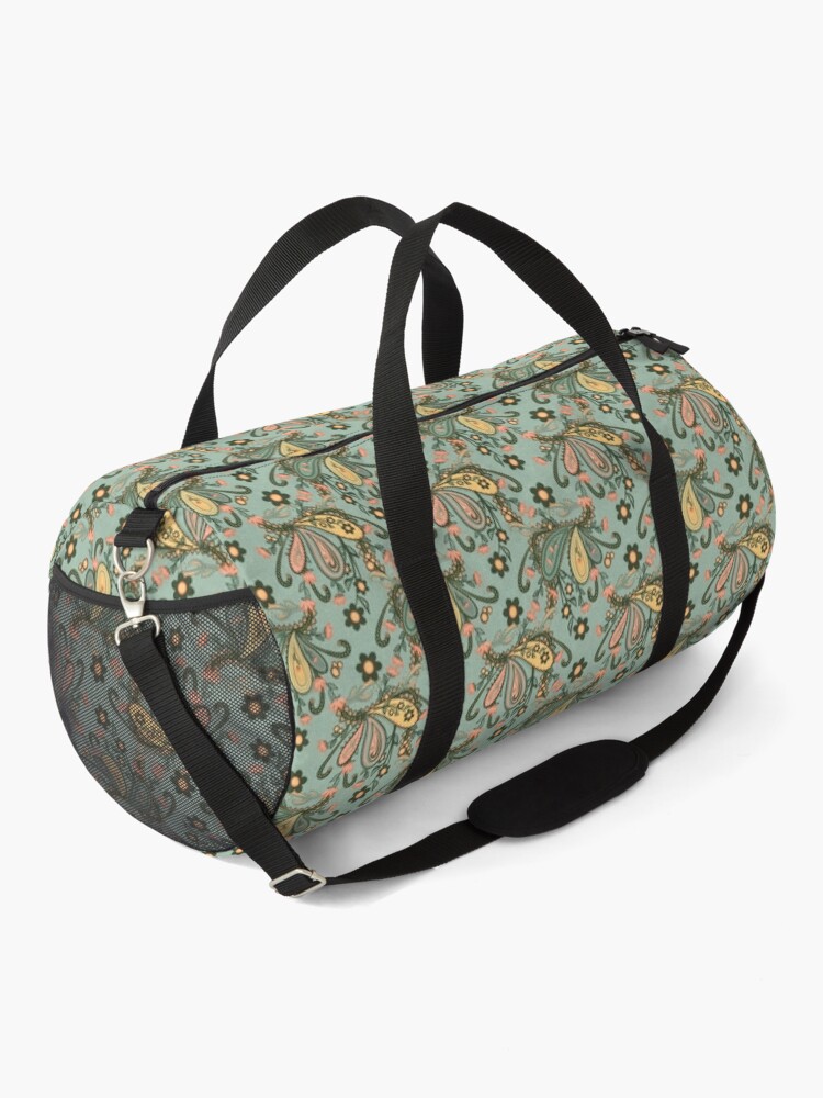
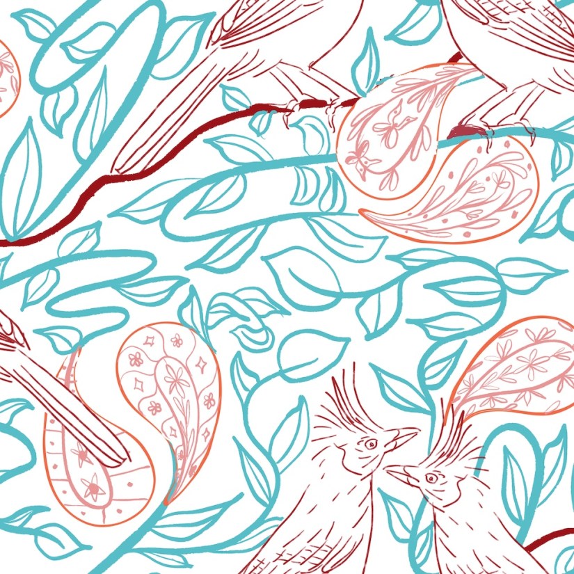
I know paisley — see the above paisley pattern in a duffle bag. That was a fun pattern to create — lots of intricate details. So taking part in a paisley challenge sounded fun.
The twist is, the pattern challenge requires novelty. Novelty Paisley Design Challenge at Spoonflower.
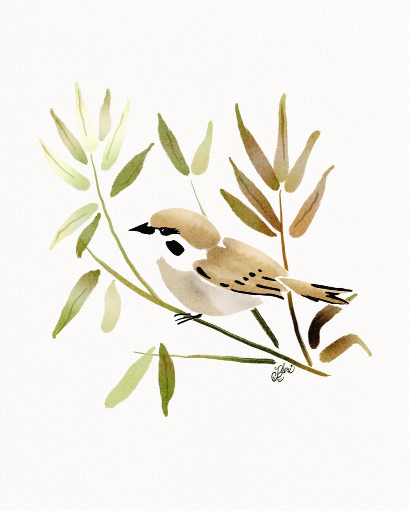
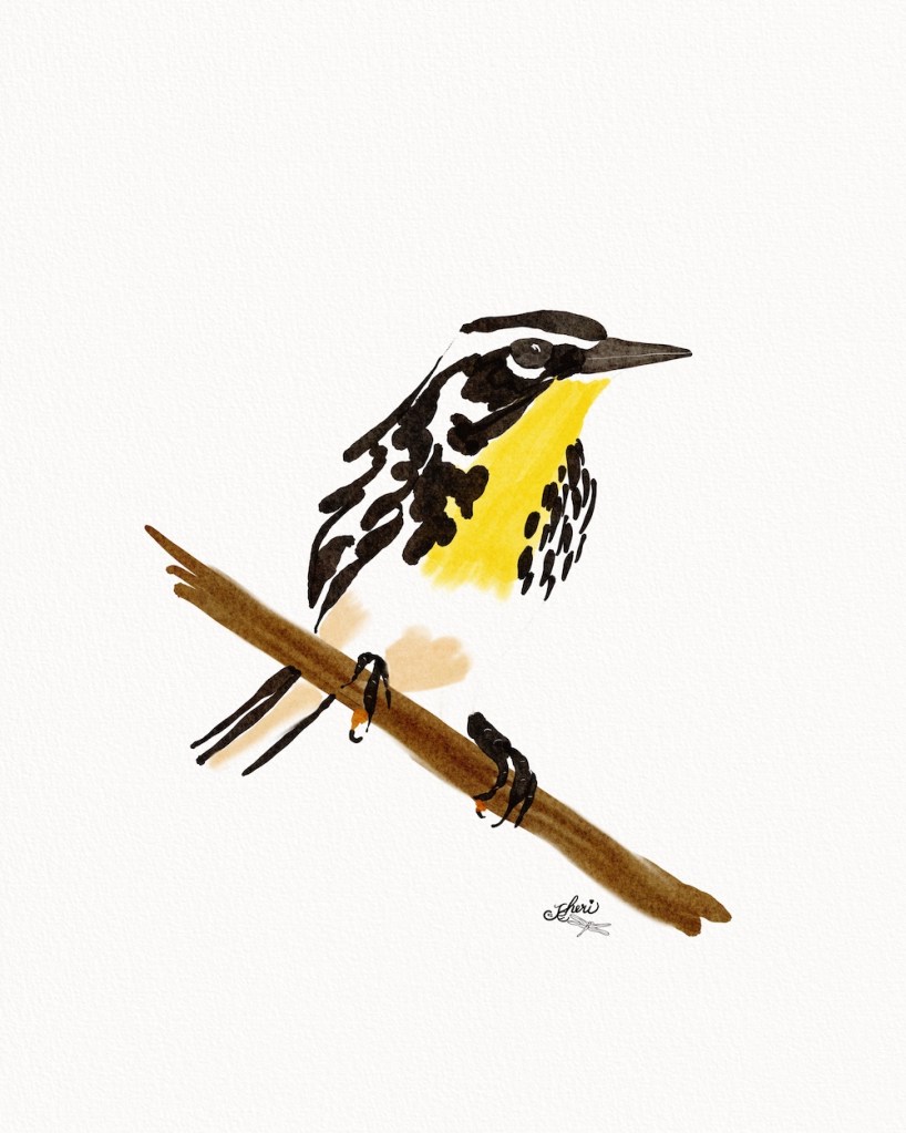
And I’ve illustrated some lovely animal pieces in different styles and mediums. So bringing an animal into the paisley seemed like a great way to add novelty.


Flow of Struggle
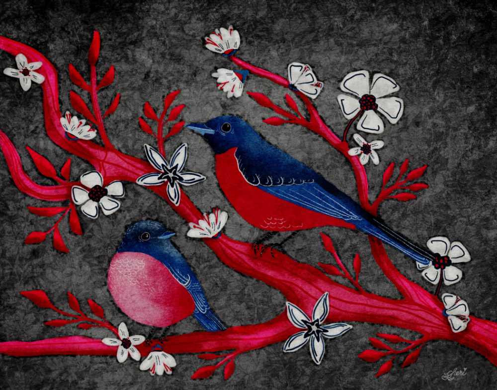
The problem is choosing the style– I stayed with the style of the original paisley, but I wanted bright colors. I thought of the lovely bird, the Stellar’s Jay — a large, bright blue bird with a black head. I wanted to try some bright colors too, to add to the novelty as the colors of spring begin to bloom in the real world.
I played with the style to create a blue jay playing around a paisley “tree.”
I also wanted a less conspicuous pattern, a drop pattern.

I kept working through the outlines of the drop pattern, but it just wasn’t inspiring me.
I just didn’t like the look of it. The heads. Rather artificial texture, though the texture and colors fits with the dopamine trend. I should have stuck with this.
Hide n Seek with Cats and Birds
Instead, I returned to an idea I’d had earlier– cats and birds playing hide and seek in a paisley garden. I imagined cats peeking into paisleys with birds peeking out. I also worked on several different color palettes.

Eventually I chose a yellow / yellow-orange limited palette with some brights added. It took many canvases. Layers of the outline moving back and forth between sides, top, bottom of the drop pattern. Layers with the inking process. And finally layers to create the pattern. Oh, and a birthday card.
Still, though I like the colors, I am disappointed in the style– I tried to add texture to the cats, birds, and paisleys in some way. But I just was not happy with the flatness of it.
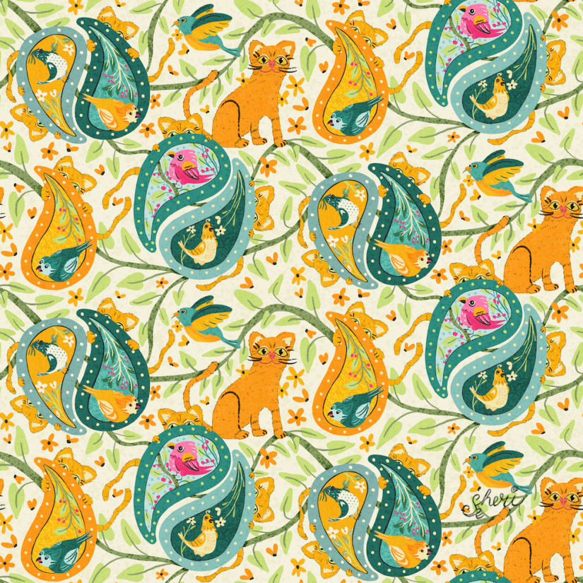
There’s a lot of detail here for a drop pattern. Like I said — lots of splitting and remixing the pattern to fill in the center and top/bottom required a lot of time and careful snapping, which I had no problems with.
I look at this and see the paisleys must be too big; vines are horizontal lines. I’d like to change the cat’s face a bit, but the cat’s are OK, except the color of the cat is too close to the paisley orange, though they look very different together on the palette. I just could not bring myself to change the orange paisley to a bright pink. The birds are funky, and I’m not sure I like that. I just think I can do better.
One thing I really want to learn is is related to the cat / paisley color issue. There’s a lot of detail in this, so how does one go about choosing a limited palette so everything is not crazy?
After reviewing and rereading all this, I also see that something is missing, and that might be what would help this pattern. Bright pink flowers blooming on the vine. That would bring out the pink cardinals and break up the horizontalness of the vines. I had just thought of the paisleys as flowers without thinking of adding in actual flower motifs.
When I have time, I might just work on these:
- Cat’s face
- Orange Paisley
- Add large pink flowers
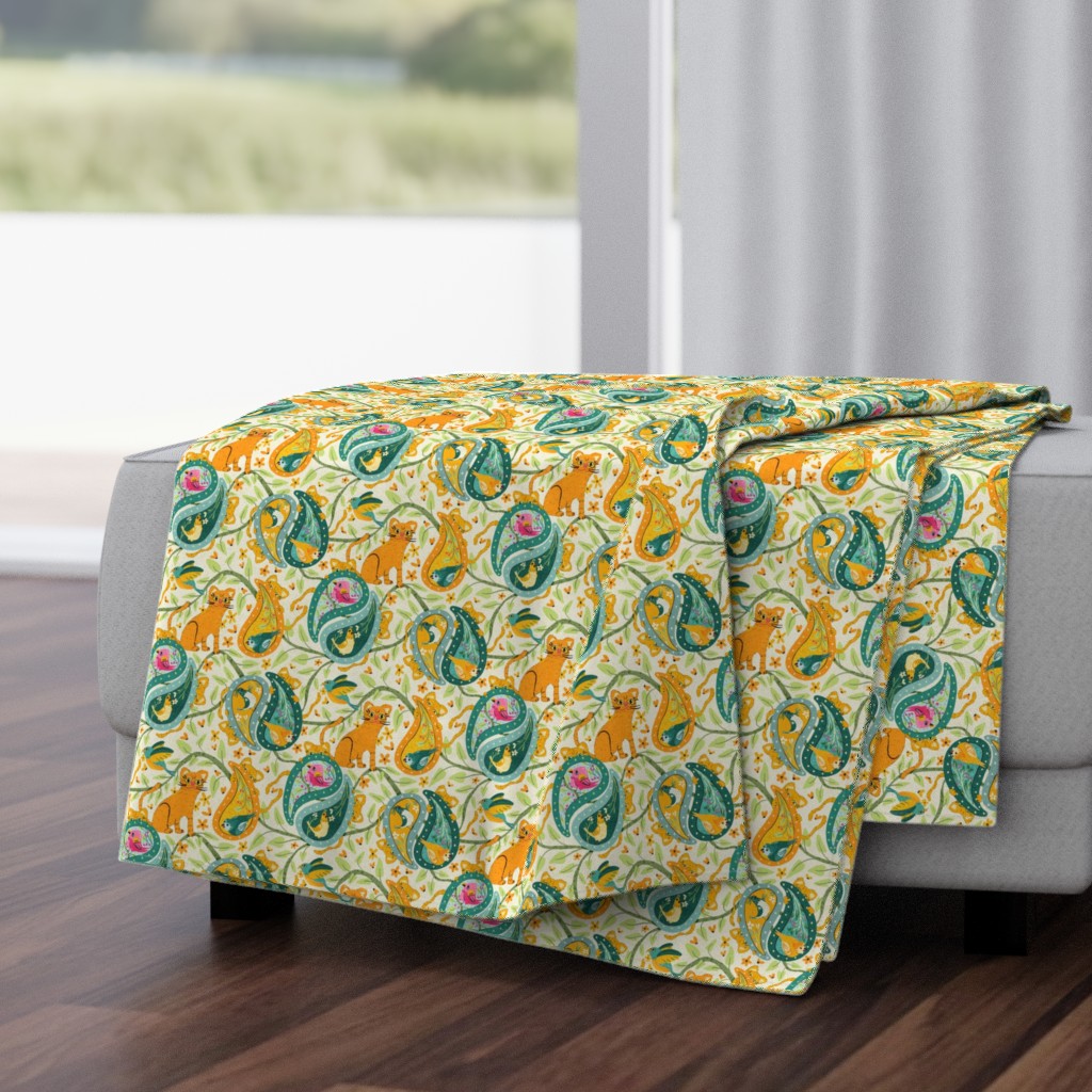
I usually don’t have a problem visually and sketching my pattern, but I struggled with this one. Even so, my granddaughter and great-granddaughter would actually just love this throw blanket:
Have you struggled with a pattern?
What was your process for thinking through what to do with a pattern and the motifs that just were not working out? One of the reasons for this blog is to write it out, think it through, hash it out. So, what’s your strategy?
