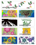
A Spoonflower challenge this month is Classic Blue — create a wallpaper design using only and all four class blue hues: Ice (#E9F4FF), Slate (#92B0CA), Classic Blue (#0F4C81), Midnight (#012E54), which are these:

Blue is my favorite color, so I thought I’d give it a go and try again at designing a pattern in Affinity Designer. I’m still learning, so I thought I ‘d share my work and how I progressed through the process.
I started by thinking about the kind of design I wanted — I opted for, since the colors are muted, an Art Nouveau pattern. I did some research and found some designs inan old online book. I created an inspiration board for more ideas. I loved the iris, and decided to create an asset to use in Affinity Designer.

With the basic element/asset created, I adapted the parts of that to be in the nouveau style border and background. You can see the “root / base” of the iris in the border — and in some of the backgrounds of later iterations [below]. The highlight of the dangling petals became the spiral in the light background. I changed colors over and and over until this pattern of colors seemed to work.

Here’s the pattern [4×4] repeat:

And 8×8 repeat:

I wrote about the patterns on another blog here [Art Nouveau 2], and let them sit and simmer awhile on the iPad and in my mind because it seems too busy.
It is a bit busy, so I changed the background, repeating other parts of the iris:
The three teardrops of the base and the tall petal on its upper left. They became part of a “quieter” border line– here is the 4by4 pattern:

It seemed a bit busy too, so I hid some of the irises and formed this pattern:

The pattern 4by4 is:

And 8by8:
I wondered what would happen if I lightened the background:

4by4:

8by8:

16×16

Now, the big decision: Which one do I enter into the challenge? And I need to fiddle with the very first pattern with the bold border; it’s way too busy, but with the border, it is a bit harder to find a good layout.
I know these not great, but it’s a try and that’s what’s fun and challenging for me, a seventy-year old art novice.
How do you plan your designs? Make choices? And which of these do you like?


