
Faded Resort Challenge
I was a bit stumped about the Spoonflower Faded Resort challenge. I kept thinking of summer vacations at the coast or the lake. My summer vacations were never at a resorts, always at a lake in an old cabin, nothing fancy, but plenty of fun with cousins.
The description of of the challenge mentioned sun-bleached, coast, and colors of terra cotta, sand, clay, pinks, yellows. I imagined tropical leaves and creatures on the shore.
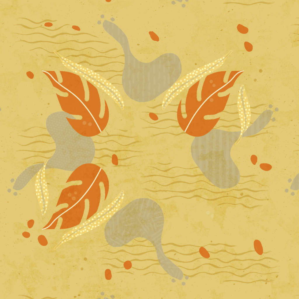
I started with this. First it was simply the leaves and the blobs of sand or clay– symmetrical. But the symmetry was too much, so I masked one of the leaves and added thin leaves and textures. I added overall textures to get that gritty sandy feel and then the ripple marks. Then I added the terra cotta pebbles. I was unhappy with the whole thing.
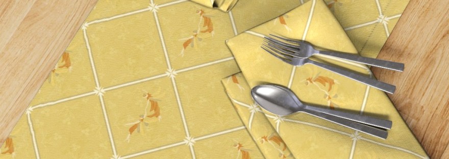
So I scratched that, saving it for later. I remembered my little fairies that I love for vintage work, thinking of a resort with wall paper or stone-tiled walkways. So with symmetry again I created the diamond center, a symmetrical floral pattern, and the fairies in the center. I added dots to the diamonds without the fairies. It still needed more work. But I did like these colors and the texture in the background to give the tiles that faded, worn look.
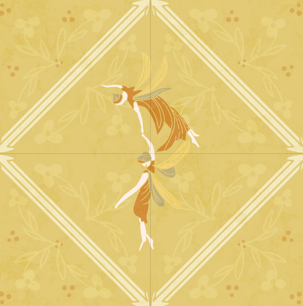
I added a bit of shading to the diamond border.
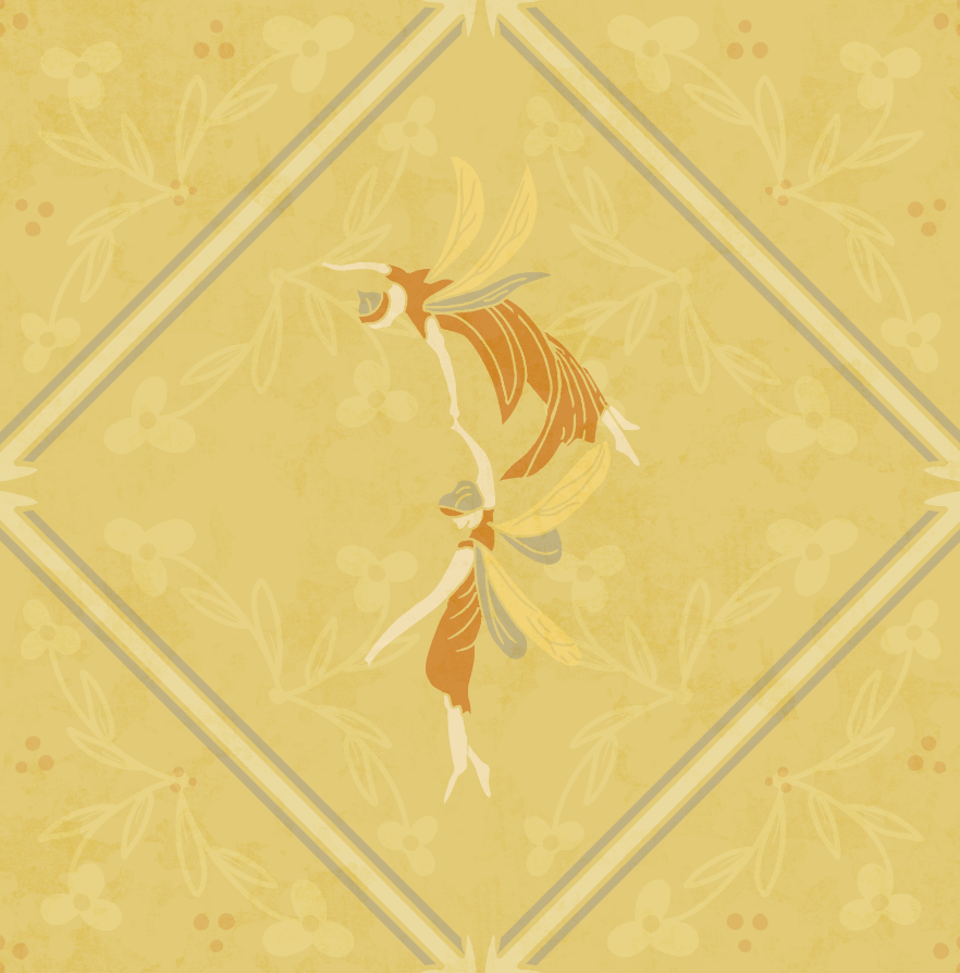
I eliminated the dots– they were two much and seemed to take away from the “faded” look. The diamond also added a lighter color to the border– accidentally. LOL.
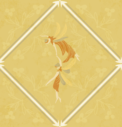
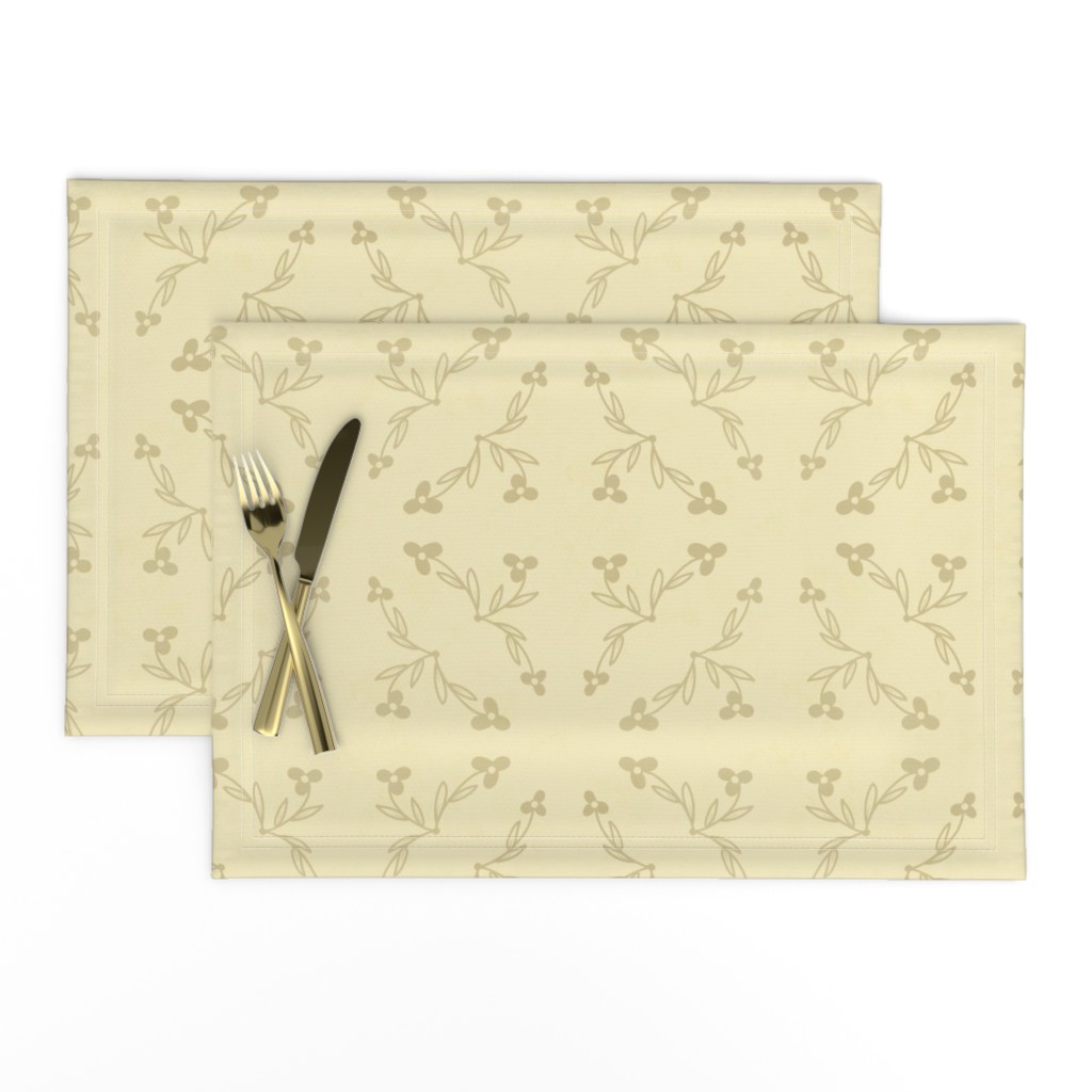
I decided the floral symmetry would make a good blender, using the sand and clay colors to keep them subtle.
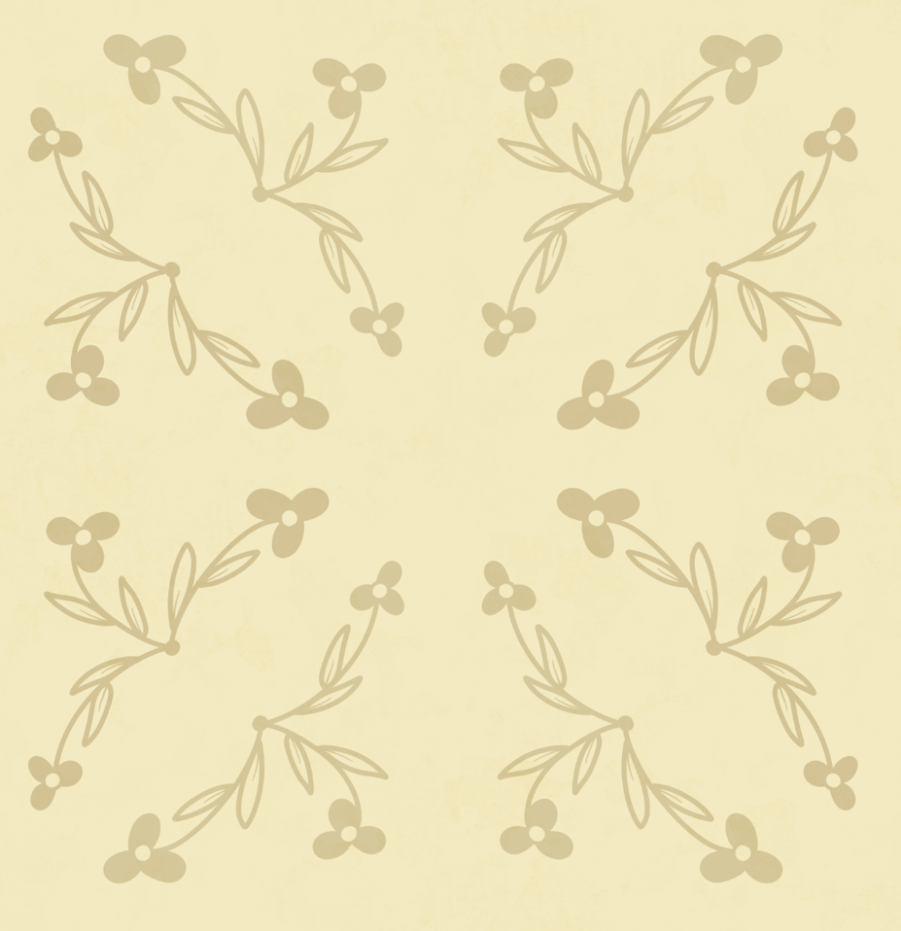
Then I returned to the abstract. I added in the fairies, removed some of the thin leaves, and added feathers. The abstract would look fine as a pillow or accessory.
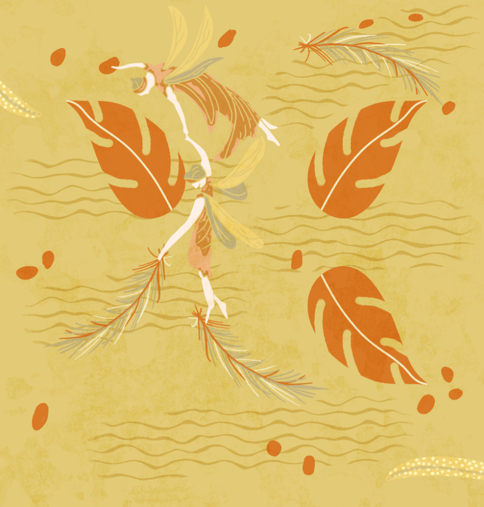
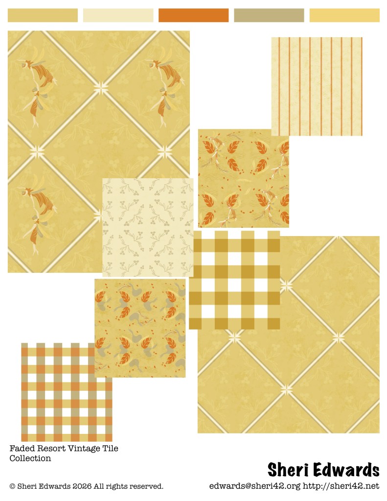
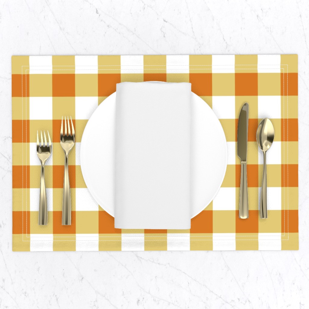
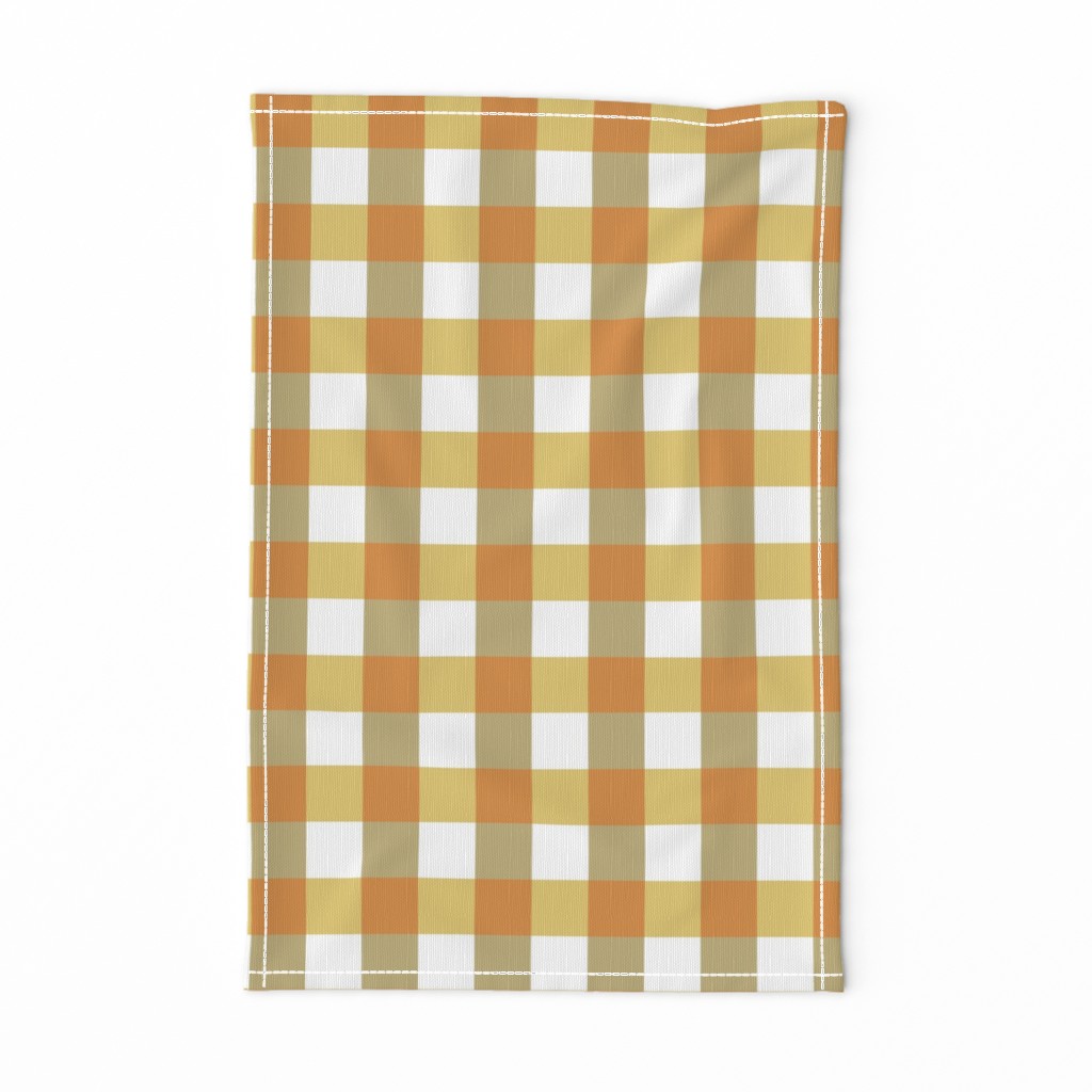
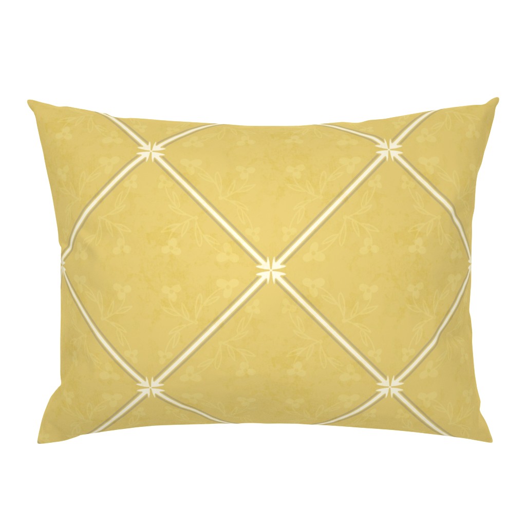
For more blenders, I created the gingham and striped designs. I tweaked the final fairy design a bit too, adjusting the border a bit. I’m still a bit surprised that I left the lighter color in, but it does look like a faded tile, which I like. I decided to include a blender with the fairies removed, just the diamond pattern of faded florals.
Vintage Faded Resort
Imagine that nostalgic resort on the coast, where weathered fairy tiles invoke calm and comfort as sunset rays soften the painterly effects of terra cotta, yellows, sand, clay. Dream away in a faded symmetry story.
I created several blenders/coordinates for the main tile pattern. You can see the whole collection on Spoonflower here.
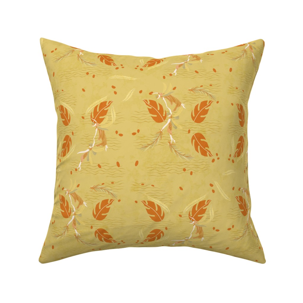
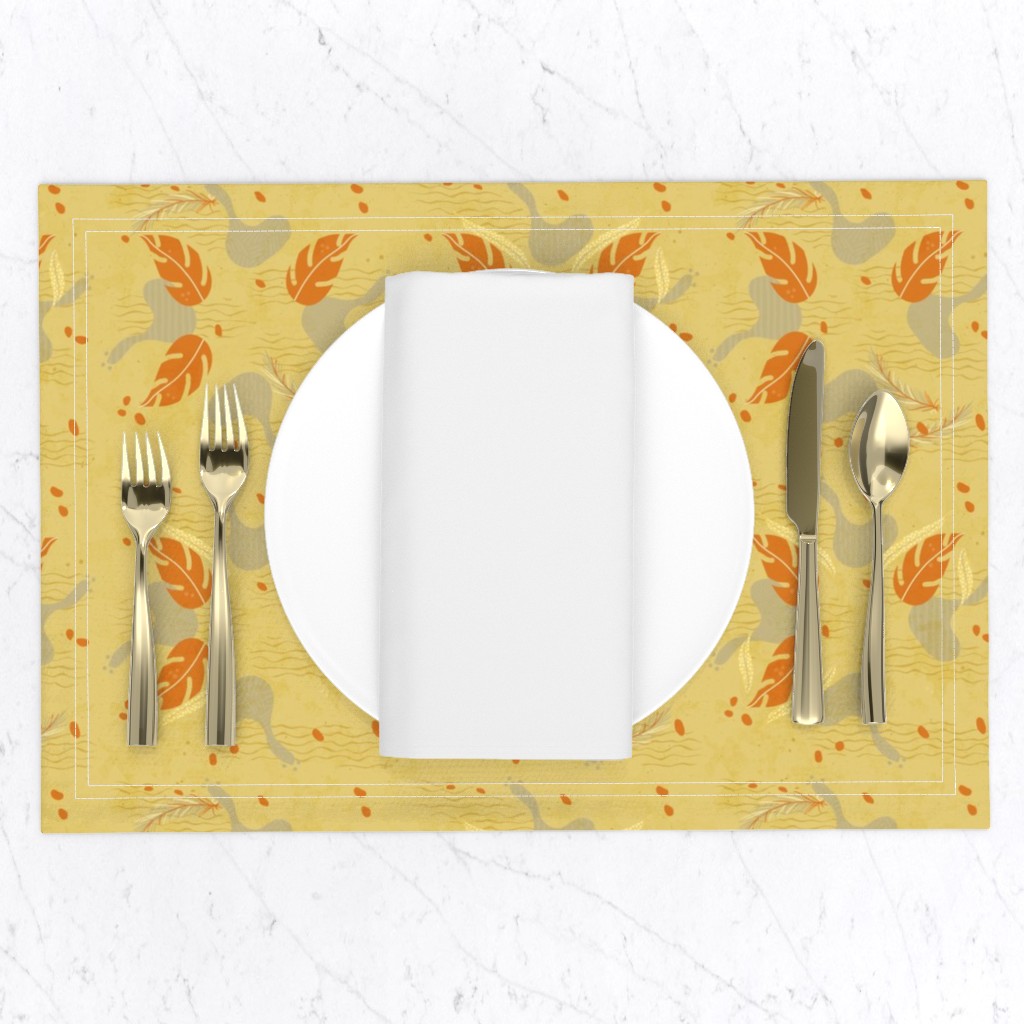
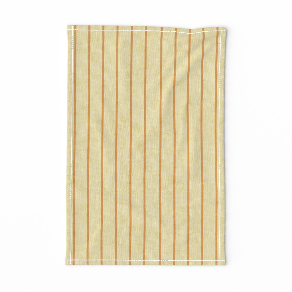
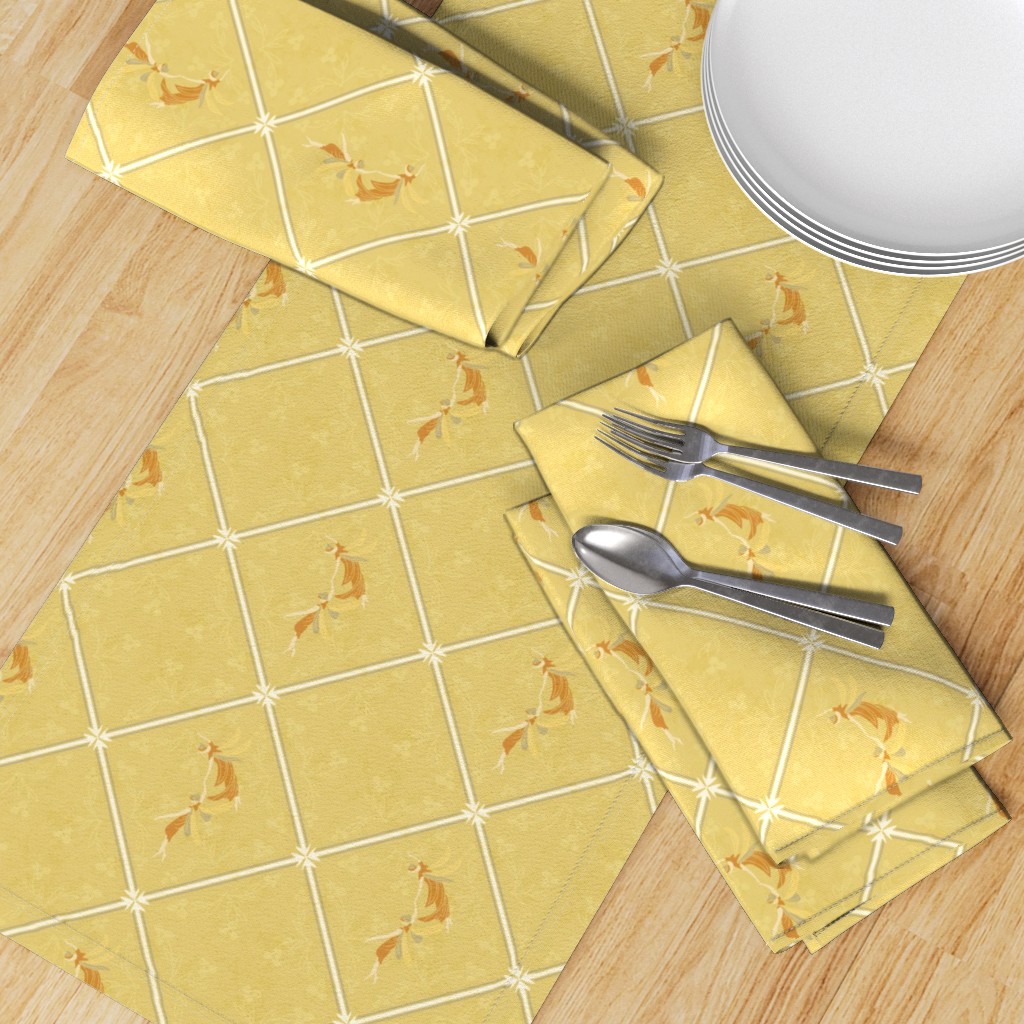
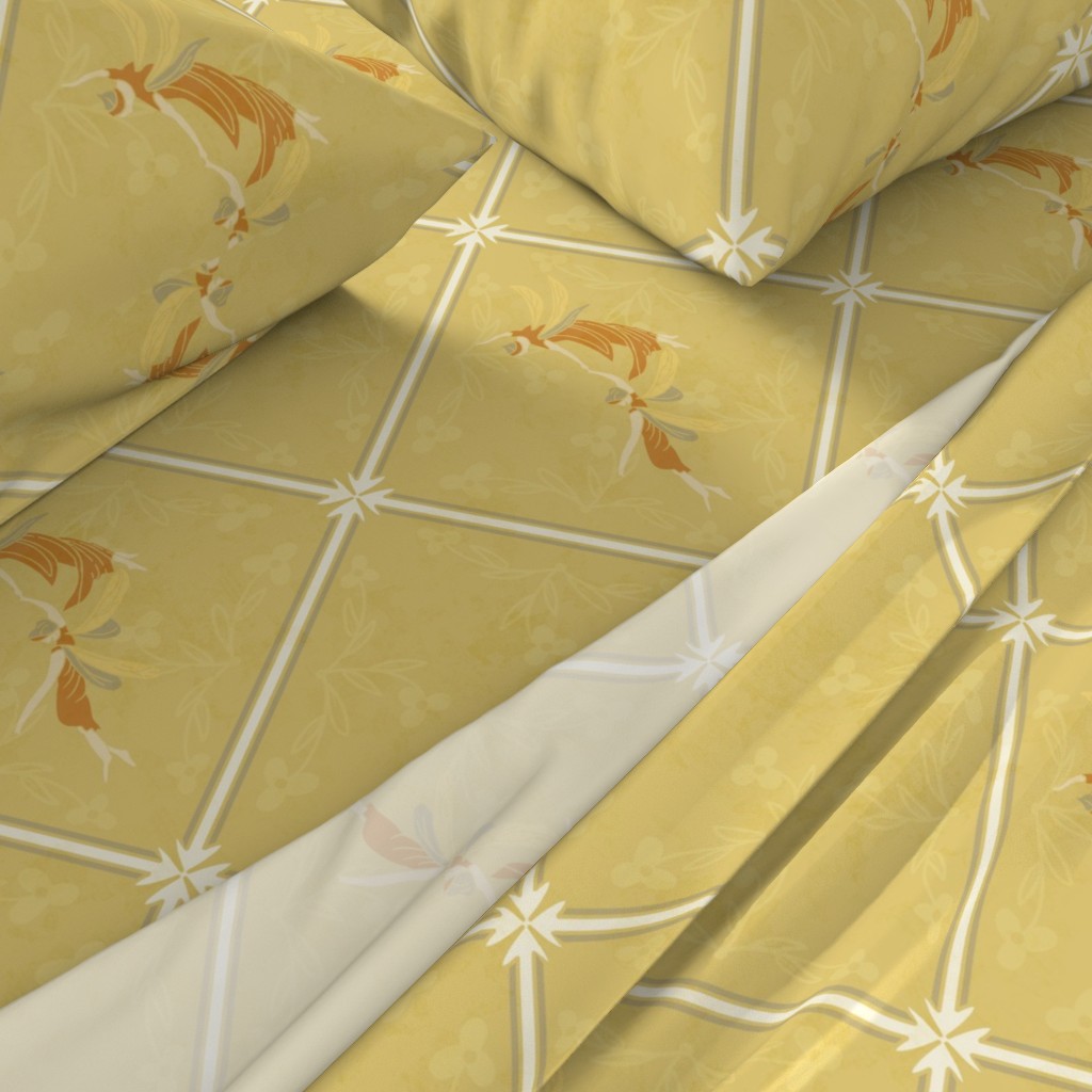
And that’s the process: I start with an idea, often dismiss it and start another. I rework each one until I find a balance of motifs and colors in style or pattern form that appeals. Blenders sort of develop as I work. Even though these colors are not my favorite, I do like the diamond tiled patterns I designed.
If you have any questions, just ask! Thanks for stopping by!


